In an age when the average westerner is bombarded by a veritable fire hose of images every day, crafting a strong identity that sets you apart from the crowd is more crucial than ever. This week we greet a nostalgic event poster with a big, silly grin, drown our sorrows at an Asian gastropub, and marvel over an ever-changing museum identity suite that whisks us through the decades. (Previous Cool Designs of the Week can be found here.)
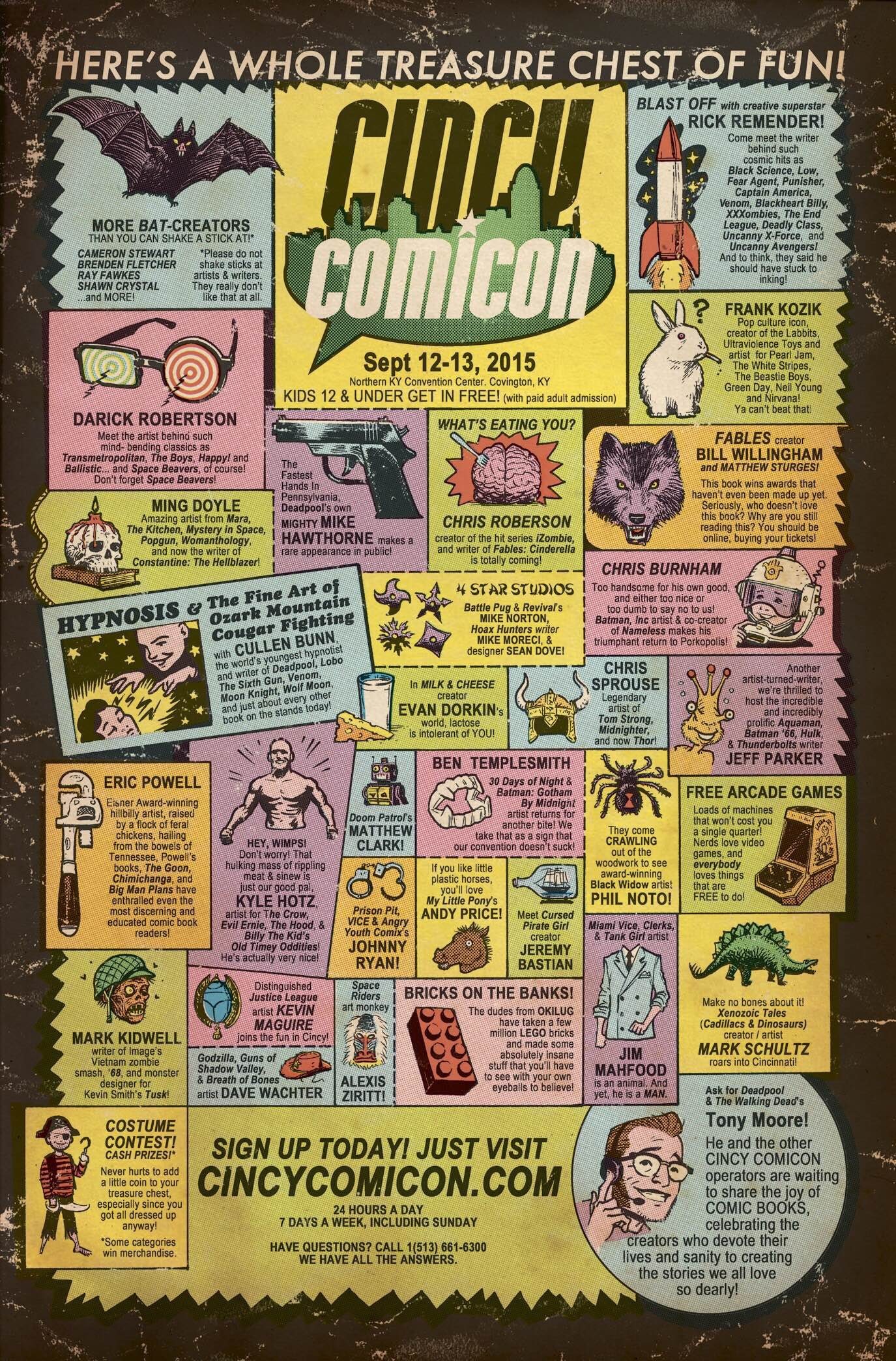
Cincy Comicon Poster Design
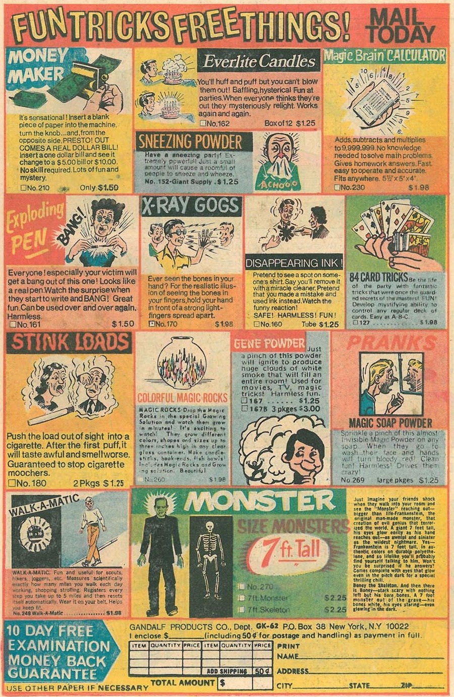
Ensconced as we are in the Era of the Geek, comic book conventions are positively everywhere. The poster that Walking Dead co-creator Tony Moore came up with for Northern Kentucky’s Cincy Comicon grabbed our attention right away because of its fun and informative riff on the ads frequently found in the comic books of the ’70s and ’80s [see second image below for comparison]. As Moore told Boing Boing:
“The real challenge came in making it feel authentic. Between the type and design, the newsprint, the weak inks, and the off-register printing, I tried to find that balance of keeping it eye-catching enough that you’d have to stop and wonder, but also use every bit of what I know about separations and pre-press to capture all those familiar printing flaws that make a dig through the old long box so endearing. Since we’re a new breed of old-fashioned comic book show, the whole thing just seemed right.”
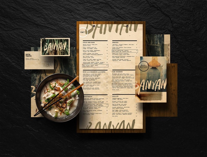
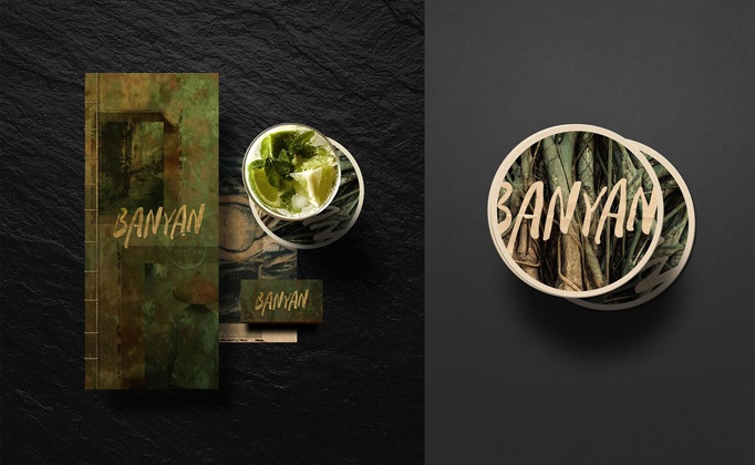
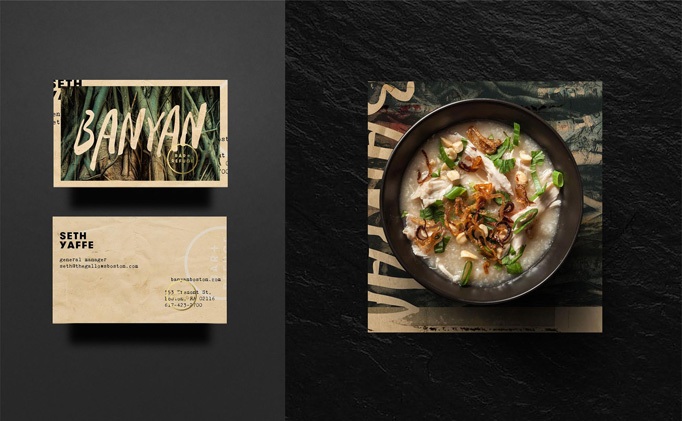
Asian Gastropub Identity Design
Most restaurant identity pieces are the design equivalent of hospital cuisine – bland, bland, bland…which makes good design stand out all the more dramatically. We love every piece for Banyan Bar + Refuge that Boston’s Adam & Co. came up with, from the postcards and menus to the beverage coasters. Good, compelling design that leaves you with no question of the type of food you’re letting yourself in for, nor the seriousness with which they approach its presentation.
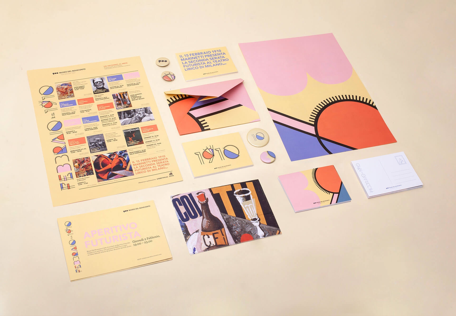
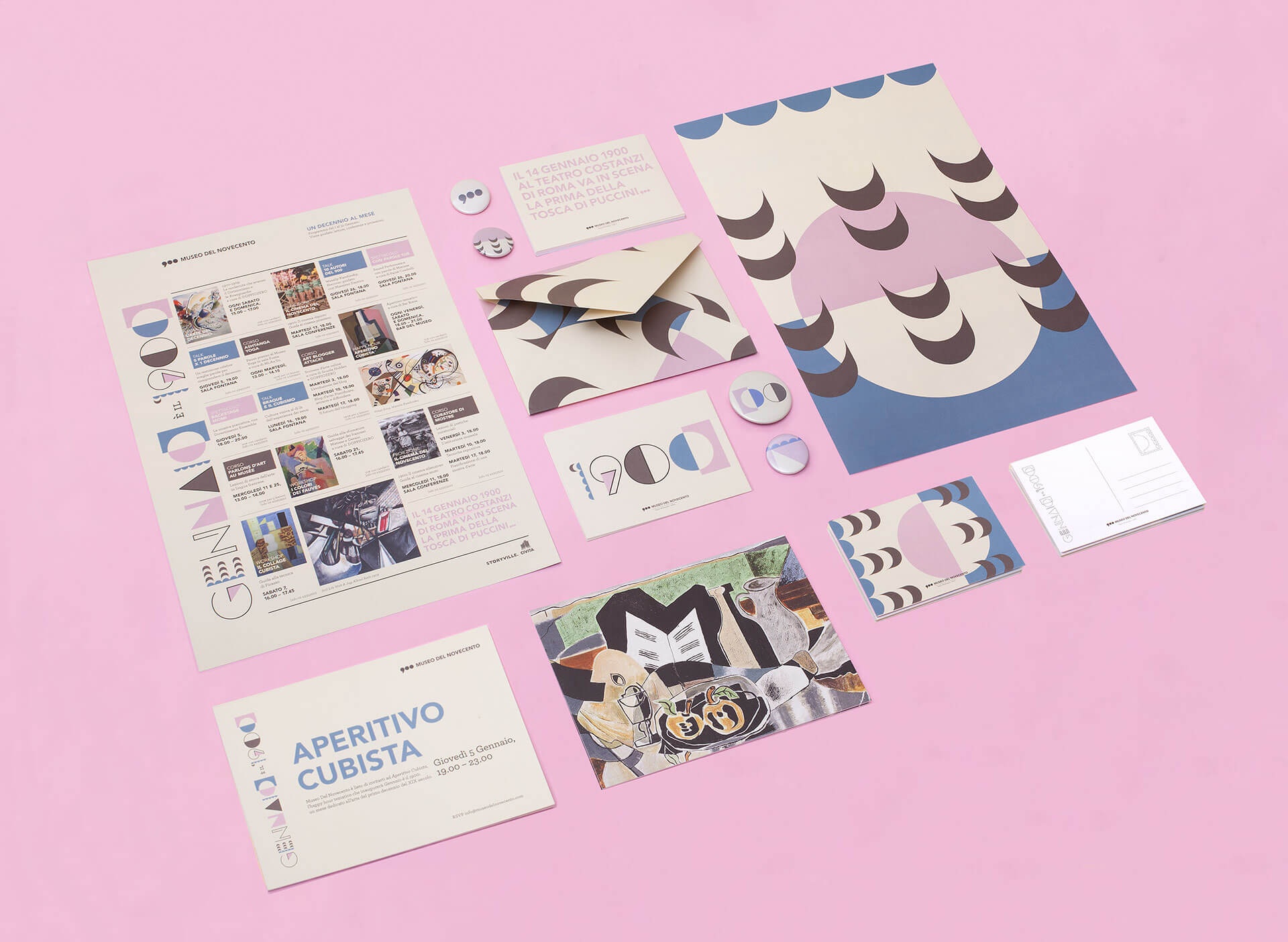
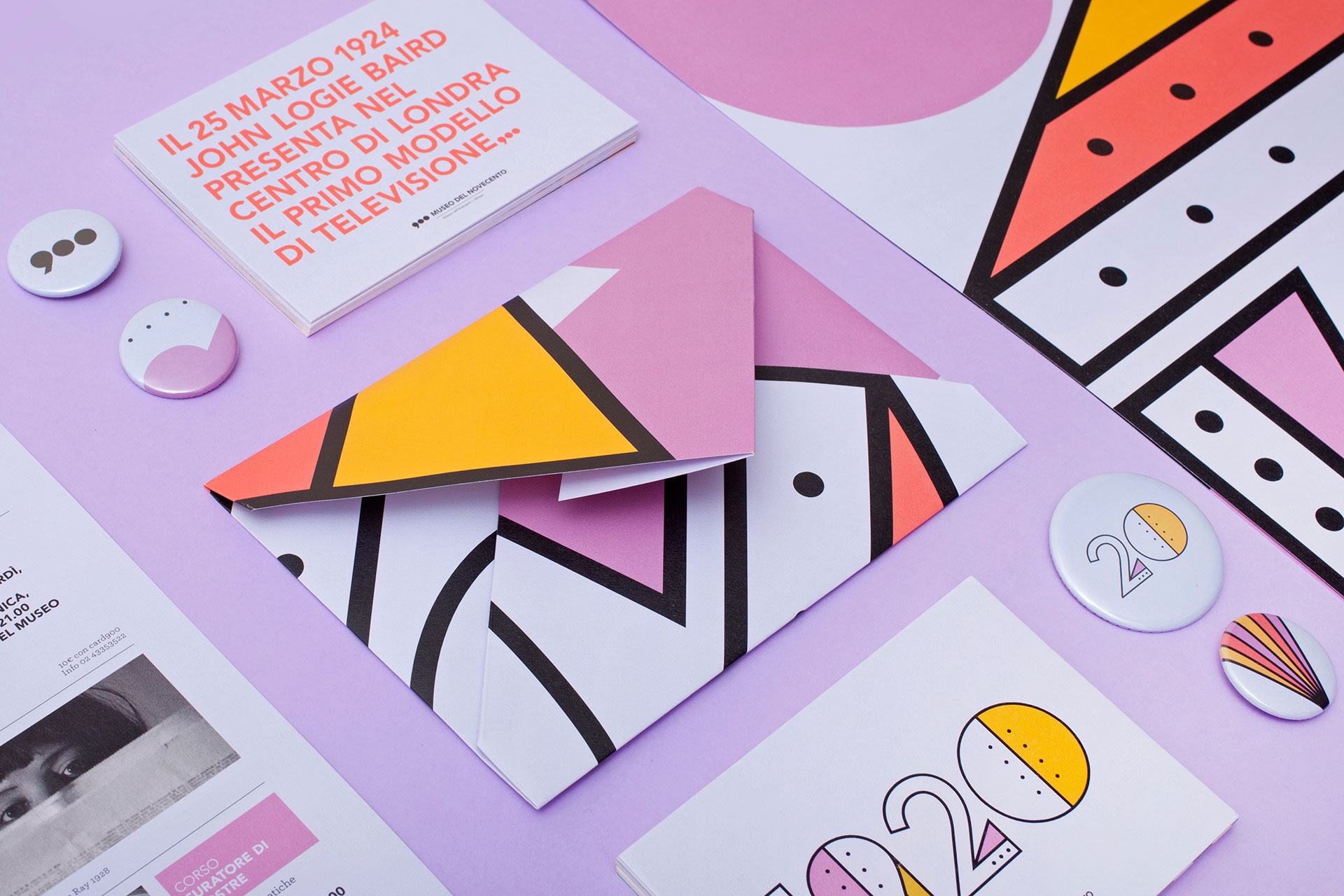
Museum Program Materials Design
When we were little we wanted to run away to live in a bookstore. Today, this minute, we would like to run away and live inside Alice Donadoni‘s brain. Take a look at the changing branding she created for Milan’s Museo del Novecento and you might understand why. As Design and Paper explains:
“For its yearly programme the curators at Museo del Novecento, the Twentieth Century Museum, decided to focus every month’s activities on one decade of the 20th Century. Each decade was represented through its most significant artistic movement: starting from the same typeface basis, the characters were manipulated to mimic the strongest features of the leading art style. Alice Alice Donadoni was commissioned to create the total look for the first three months of the year, from the 1900’s Cubism, 1910’s Futurism to 1920’s Italian metaphysical art.”