 Mohawk Fine Papers
“There is no truth. There is only perception.”
– Gustave Flaubert (1821-1880)
The Merriam-Webster Dictionary broadly defines perception as, “the way that you notice or understand something using one of your senses.”
Anais Nin once claimed, “It is the function of art to renew our perception. What we are familiar with we cease to see. The writer shakes up the familiar scene and, as if by magic, we see a new meaning in it.”
The information we take in through our senses defines the way we understand and interact with our world. We may all see the same scene, yet we may tell a completely different story.
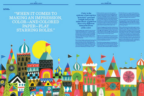
Design certainly shapes perception. Every choice we make – whether typeface or tool, pixel or paper – has the power to create impressions and change minds. That is the power of perception.
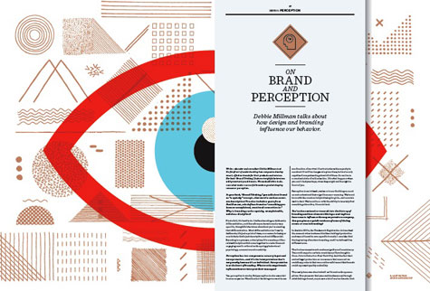
The new issue of the Mohawk Maker Quarterly, which debuts next week, explores the influence of art and design on perception. The fifth issue in Mohawk’s series of Maker publications features an interview with brand consultant/writer/educator Debbie Millman about how companies have historically used design to influence the way we perceive their goods and services.
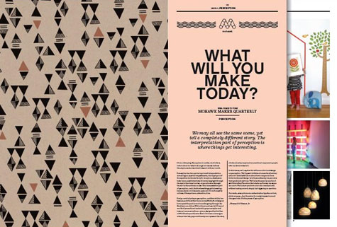
According to Dora Drimalas, Principal of Hybrid Design – the creative team behind the creation of the Mohawk Quarterly – “Perception is an incredible tool. It’s our direct connection to the world, and the meaning we give to what our senses detect. But our perceptions change, evolve, and are influenced by numerous factors out in the world: color, texture, light, shape, and space. All these factors color how we see the world, and ultimately, the meaning we take away from what we experience.”
Of note, Drimalas and the talented team at Hybrid were recently honored with an AIGA Justified Award, the graphic design industry’s most selective competition, for the development and design of the Mohawk Maker Campaign, including the Mohawk Quarterly.
“The latest Mohawk Maker Quarterly is meant to play with perception and invite the reader to thoroughly enjoy the content on the page through the thoughtful simplicity of the design elements used,” Drimalas continues.
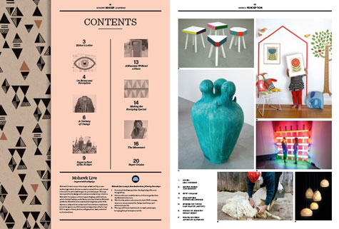
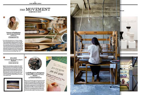
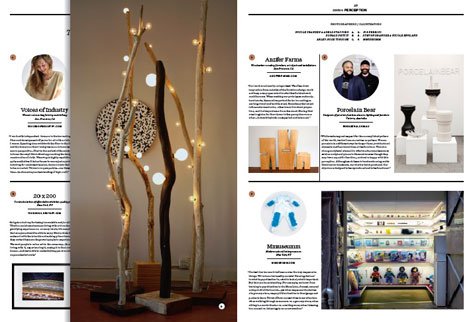
Mohawk Maker Quarterly issue No. 05 also features profiles of the following designers and makers:
- Levi’s, A case study in the evolution of brand perception featuring one of America’s oldest and best known brands
- Voices of Industry, Hand-woven textiles and apparel, San Francisco
- 20 x 200, Curated selection of affordable exhibition quality prints, New York City
- Porcelain Bear, Porcelain functional wares, lighting and furniture, Victoria, Australia
- Anzfer Farms, Unique objects and installations using salvaged materials, San Francisco
- Ladyfingers Letterpress, Duo offering well-designed cards and custom invitations, Pawtucket, RI
- Mmuseumm, Modern natural history museum, New York City
- Whimsy & Spice, Brooklyn confectioners, handmade sweets, Brooklyn
- Lisa Congdon, Oakland-based artist and illustrator, Oakland, Calif.
- Petit Collage, Elevated products for children, San Francisco
- Modern House Wines, Modern wines from an unexpected family, Napa, Calif.
- Stan Bitters, Sculptor creating large-scale ceramic works, Fresno, Calif.
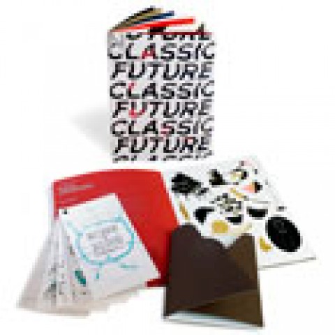
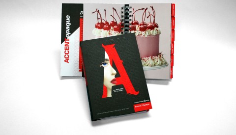
Issue No. 05 is printed on Mohawk Via and Mohawk Carnival, grades that are known for expressive color and texture. To demonstrate the beauty and range of options available within these grades, the publication features 32 printed pages featuring a variety of finishes, including:
- Mohawk Via Vellum Kraft 70 text (104gsm), pgs. 1-2, 31-32
- Mohawk Via Smooth Light Pink 70 text (104gsm), pgs. 3-4, 29-30
- Mohawk Via Smooth Light Blue 70 text (104gsm), pgs. 7-8, 25-26
- Mohawk Via Vellum Sunflower 80 text (118gsm), pgs. 11-12, 21-22
- Mohawk Carnival Smooth Stellar White 70 text (104gsm), pgs. 5-6, 9-10, 13-14, 19-20, 23-24, 27-28
- Mohawk Carnival Blue Vellum 70 text (104gsm), pgs. 15-18
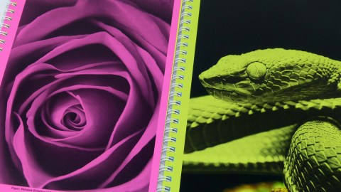
The publication’s finished size is 9.75 inches x 13.25 inches, and features short sheets (7. 2 inches x 13.25 inches) showcasing beautiful colored papers including Mohawk Via Smooth Light Pink, Mohawk Via Smooth Light Blue and Mohawk Via Vellum Sunflower.
Issue No. 05 was printed by Sandy Alexander Inc., Clifton, NJ, using four-color process, match metallic copper and spot dull varnish. Pages 15-18 (blue “Paper is Part of the Picture” article) features four hits of white and four-color process (UV inks). Page 10 features four-color process plus a second black and match metallic copper duotone.
Further exploring the concept of perception, the Mohawk Maker Quarterly is enhanced with additional content through Mohawk Live, Mohawk’s augmented reality app. By scanning photos containing the Mohawk Live icon found throughout each publication, readers can enjoy bonus content including videos and animation.
To view the Mohawk Maker Quarterly online or to sign up to receive an issue, visit www.mohawkconnects.com/cultureofcraft.
PaperSpecs readers, enter to win one of 100 copies of The Mohawk Maker Quarterly issue 05. Hurry, contest ends midnight ET 10/20.
“We don’t see things as they are; we see them as we are.”
– Anais Nin (1903-1977)