After 40 years of designing for everyone from Apple to Wells Fargo, Jennifer Morla celebrated her career-to-date with a massive volume that gives full voice to her passion for the look and feel of print. Even though I was fortunate enough to see a mock-up of the book during its design phase while visiting her studio, I didn’t realize at the time just how powerful the final result would be.
While the book design itself easily wins over the creative crowd, Jennifer’s objective was to create a book that speaks meaningfully to a non-design audience as well.
At 432 pages and being a perfect square, “Morla : Design” instantly draws you in and strikes you as more of an art object than a book, and its oh-so-touch-worthy cover only emphasizes that fact even more.
On the Deluxe edition which I have here, the tactile details are actually courtesy of a vacuum-formed, thermoplastic polycarbonate tip-on inspired by what Jennifer learned crafting the 3D cover for a 2012 book celebrating the 100th anniversary of Clorox. Here it does what every good book cover should: it sparks curiosity and, because of that vital tactile element, makes it impossible to pass by without at least running a finger over its funky form. (You can order a copy of this Deluxe edition here. Meanwhile, the cover for the Standard edition, which you can order here, features a debossed version of this same pattern.)
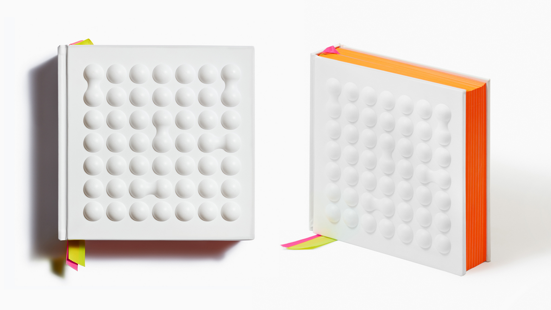
The cover concept itself, originally created by Jennifer for a textile pattern never produced, is called “Mitosis,” emulating “the biological division of a mother cell into two daughter cells — an apt metaphor for a mother with two daughters.”
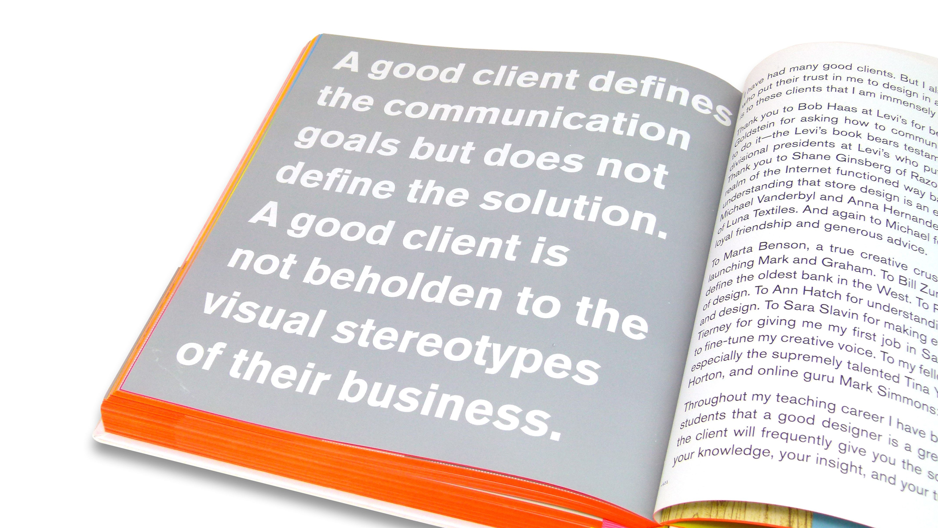
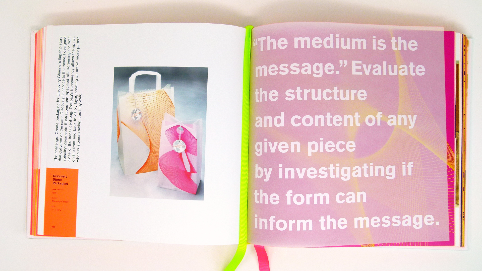
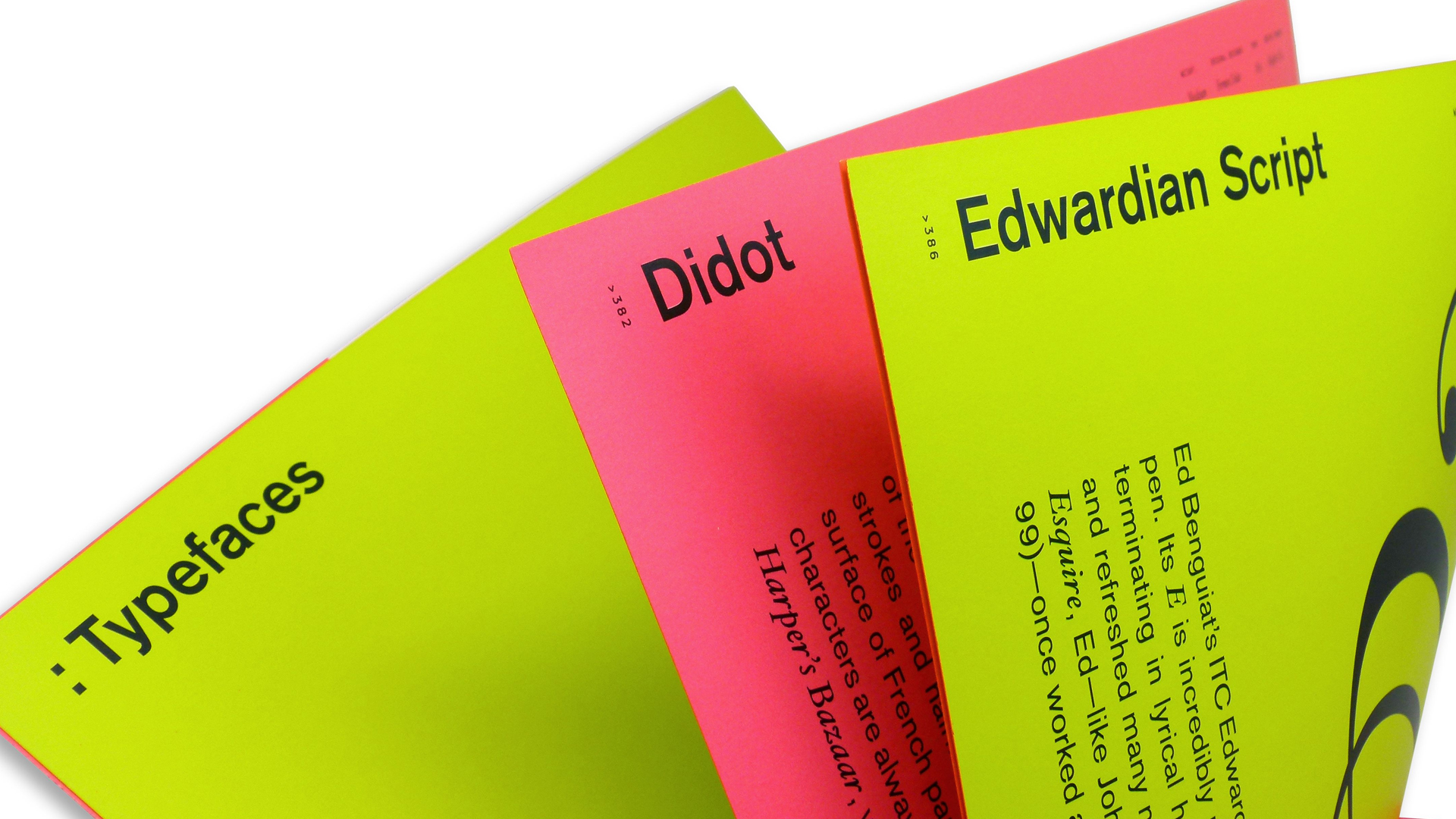
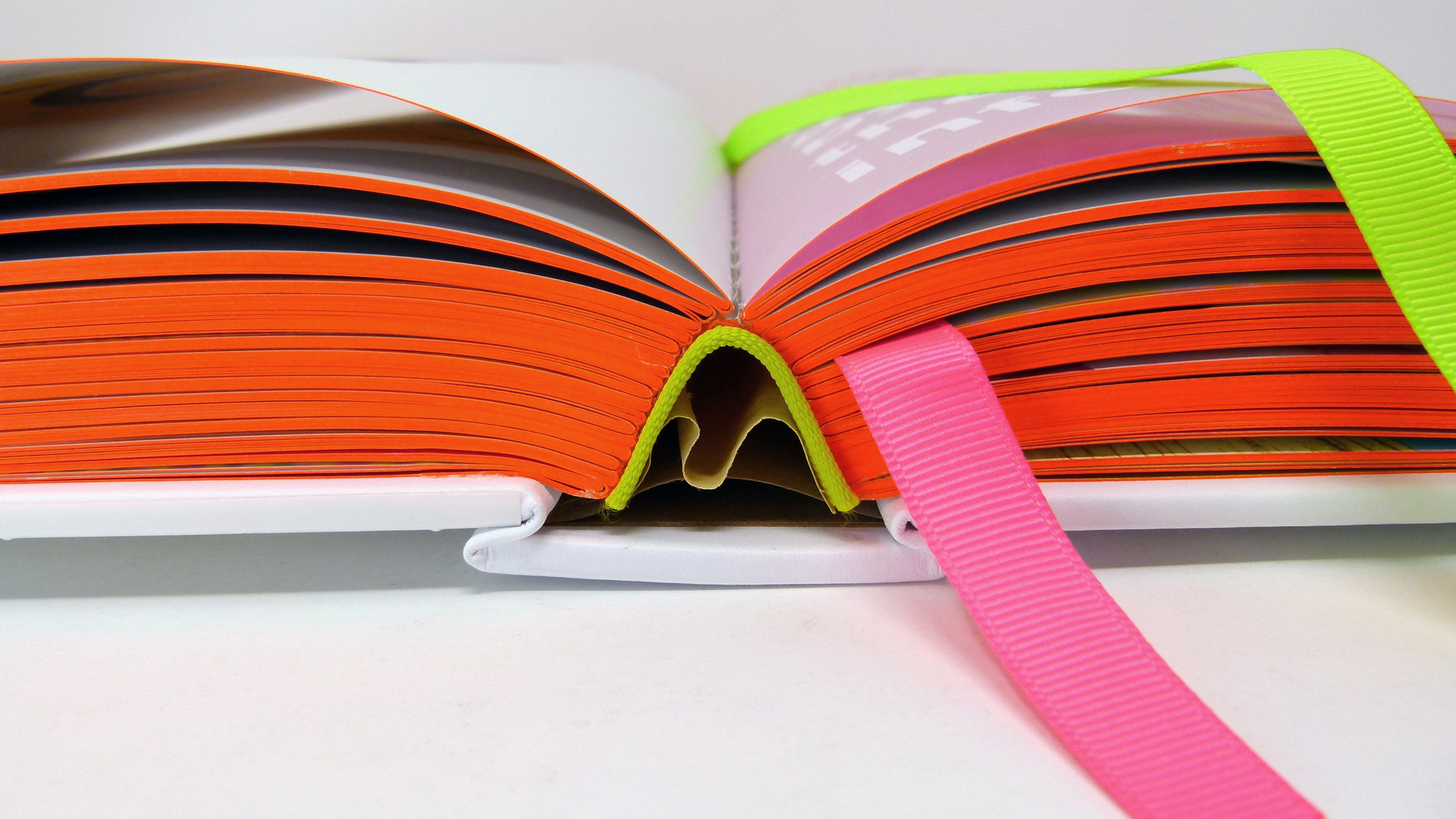
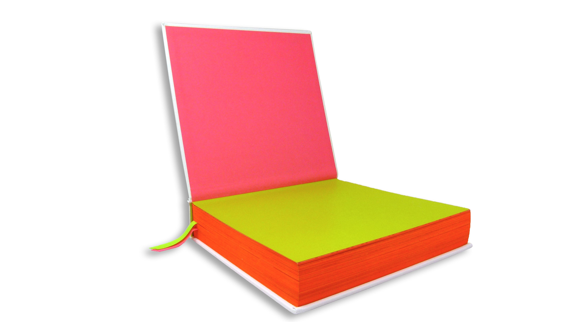
Inside, the monograph illustrates her creative process, sharing the inspiration for more than 150 projects spanning four decades. It does this in some pretty unconventional ways, too, with CMYK stochastically printed artwork, essay spreads printed in dayglow fluorescent inks, Silver inked accents throughout the book, and nuggets of design wisdom rendered in White ink on translucent fly sheets. And because this is Jennifer Morla, the final section explores some of her favorite typefaces, too.
Understated yet bold, the Smyth sewn book features neon headbands as well as fluorescent edge painting and not just one but two matching ribbon markers.
Taken as a whole, this book feels less like a trip through one designer’s portfolio and more a vibrant survey of the last 40 years of print design itself. And one every bit as bold as its cover.


