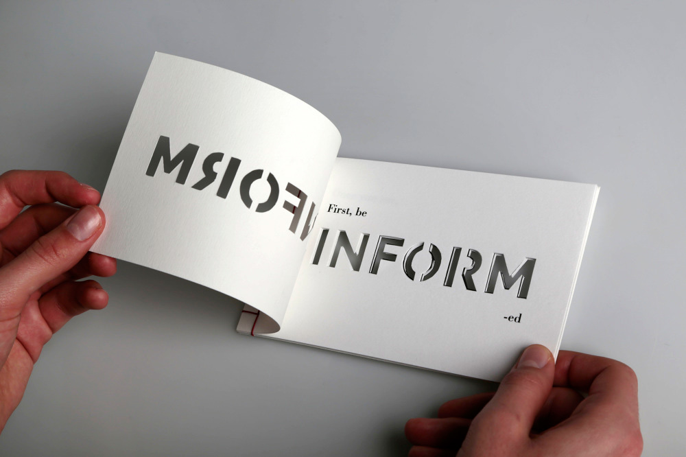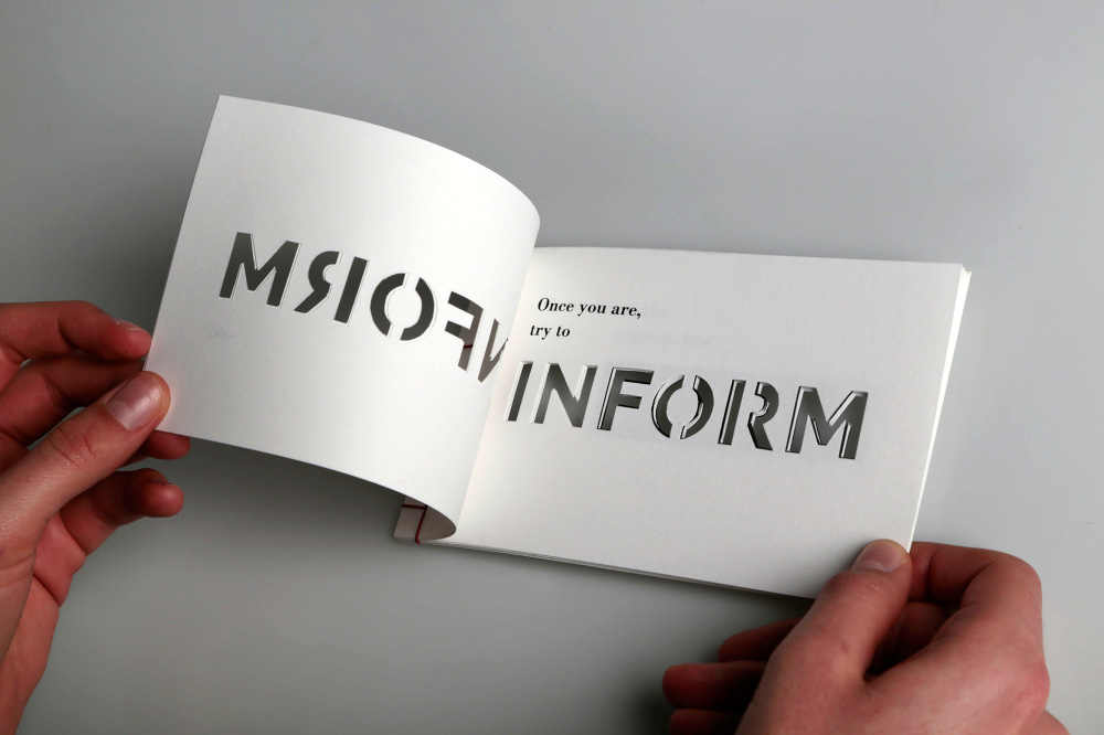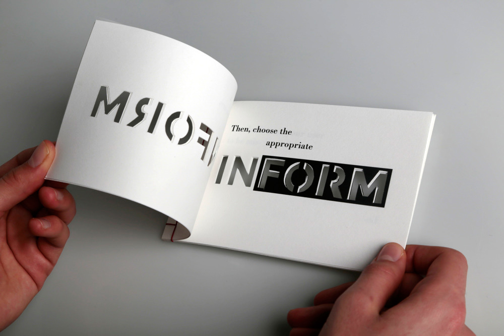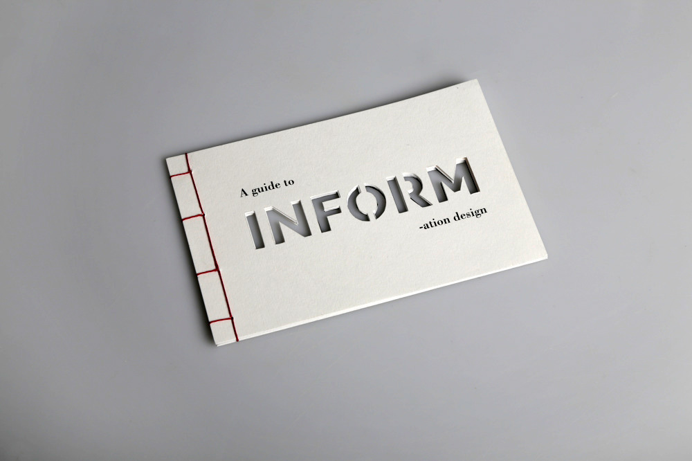
The cut letters of the word ‘INFORM’ enable the story to develop around it.
– Florence Meunier, Designer
Concept, printing and handwork align to create a thought-provoking self-promotion piece by designer Florence Meunier. This small booklet, “A Guide to INFORMation Design,” was produced on Daler Rowney smooth heavyweight drawing paper. It combines the hand-cut word ‘INFORM’ with carefully crafted, strategically positioned laser-printed copy on each page to deliver a continuous message about the information design process: “First, be INFORM-ed; Once you are, try to INFORM; Then choose the appropriate FORM…” You get the idea.
“The project would have been impossible in another medium,” admits Meunier. The stab binding was a particularly good choice, highlighting as it does the handmade nature of the whole work. “This type of binding was [also] very important as it would determine alignments of the cut sheets together.”
“A Guide to INFORMation Design” is engaging, cautionary and enlightening in a striking package – all hallmarks of Meunier’s design.