[youtube=https://www.youtube.com/watch?v=bK02yoywk_M]
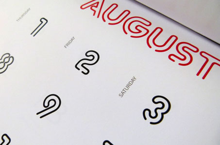
What do I love about this calendar from Studio Hinrichs?! Well … everything! From those 12 yummy fonts to the tactile non-glare McCoy Matte, the design had me at January.
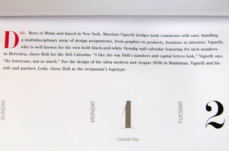
The design team asked well-known designers to choose their favorite typeface to include in the calendar. This is a great way to feature some less familiar typefaces and educate the public on the designers who create the many typefaces we use every day. The resulting collection certainly makes for a beautiful finished piece.
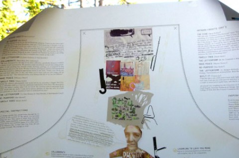
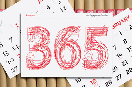
The cover pays homage to all of us who doodle to get the creative juices flowing. A big, bold red “365” pops cheerfully on that pristine white paper. Layering multiple styles of each digit, one atop the other, creates an eye-catching graphic.
The scale of this calendar really feels right, too. You can see and appreciate the fine details of the featured typefaces. It’s also cleverly designed in two sizes: 23″ x 33″ (wrapping paper anyone?) and 12″ x 18″ (perfect for the top of my desk). Other endearing touches: all contributors’ birthdays are included in the calendar, and you can actually write on the paper (now there’s an idea so often overlooked).
Love this piece?
Like it and share with your friends below.