The depth and grounded nature of this design wonderfully evokes the substance that is TED and the content its talented and learned speakers share with the world.
The multi-level sculptured emboss on the front and back cover of this guide resemble letterpress type. Running my fingers across it, I feel the rough texture of wood block images and see the three-dimensional quality of the title. Sitting amid a solid matte black background, it evokes a sense of earthiness and solidity.
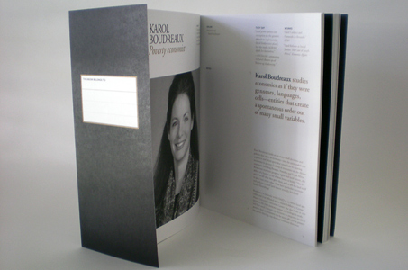
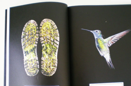
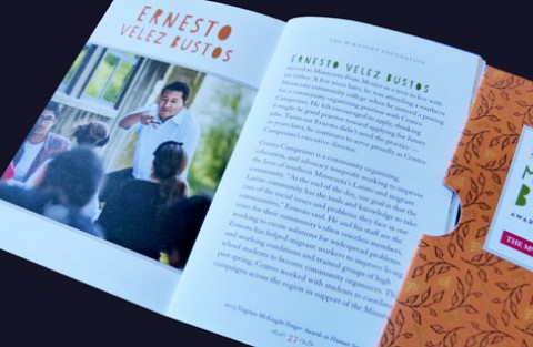
By contrast, bio pages that make up the vast majority of the guide are light, containing halftone profile pics and black and gold type. Recalling the sensibilities of the cover, there are pages printed with intense 4/color images again floating on that solid matte background. The images bring the topics of speakers to life visually.
A UV Ultragloss coating on the sponsor pages is appropriate to this section and brings their marketing messages to shiny life. So many details are required of the 240-page perfect bound book – from images of the venues to maps… from images of the global art project winners to background pages on TED – and all fit seamlessly together.