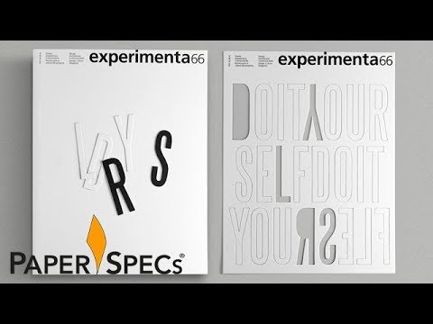
I can’t read one word of this magazine (my Spanish is too bad!), and quite frankly I don’t care (no offense to the editorial staff). It’s simply enough to hold it and leaf through it! Gorgeous from the first of its 44 pages to the last.
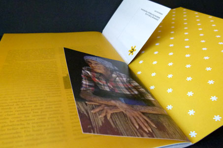
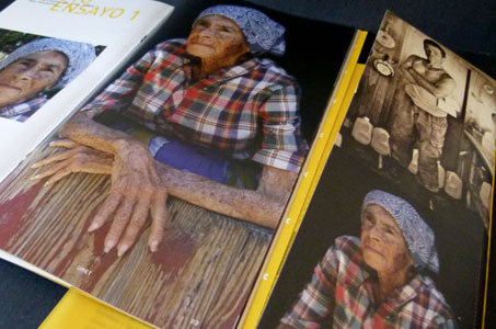
This 7.5 x 12 saddle-stitched beauty should be a textbook on how to use paper effectively and creatively. We have some text on uncoated (Sundance Cover), other sections of text on coated (Beckett Enhance Silk), translucent flysheets (Glama Natural) and postcards that sparkle (Starwhite Flash Cover).
Together, these papers all work seamlessly – conveying the personality of the publication, enhancing the stories, bringing out the best in photographs, creating a textural experience for the reader.
The palette is overall yellow and black, but even this is designed for maximum visual appeal. Cream-colored pages with black type punctuated by eye-popping highlights of citric acid. The contents page, a yellow flysheet, is prelude to a full-page illustration predominantly in red. Spreads take you on a journey from the dawn of quadtones to the night of movie-theater blacks.
It’s a feast – a scrumptious table of printed design delights. Yum!
Photo on the cover: Rafael Franco-Steeves