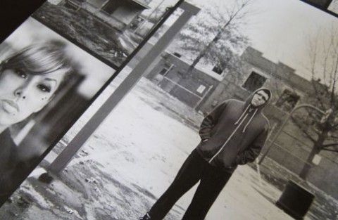
It always seems a little vulgar when big business dips its tentacles into a subculture, particularly one as grounded in youthful rebellion as skateboarding. Yet by most accounts Adidas Skateboarding – a line of footwear and apparel designed by skateboarders for skateboarders – gets it, promoting the sport as vigorously as it does its shorts, sneakers and tees. It’s an approach that’s been smartly carried over to the companion book for “Away Days,” a full-length film featuring the grinds, ollies and other breakneck maneuvers of Adidas’ global skateboarding team.
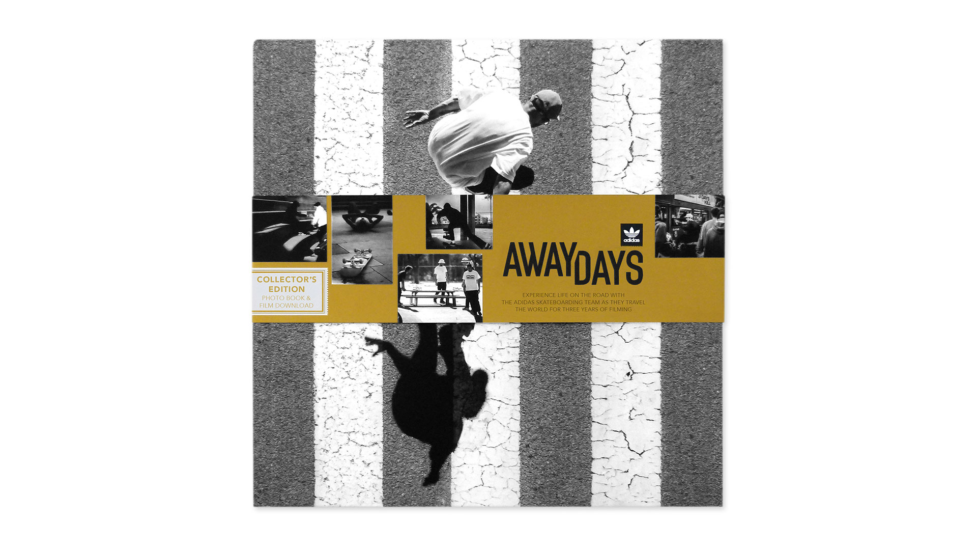
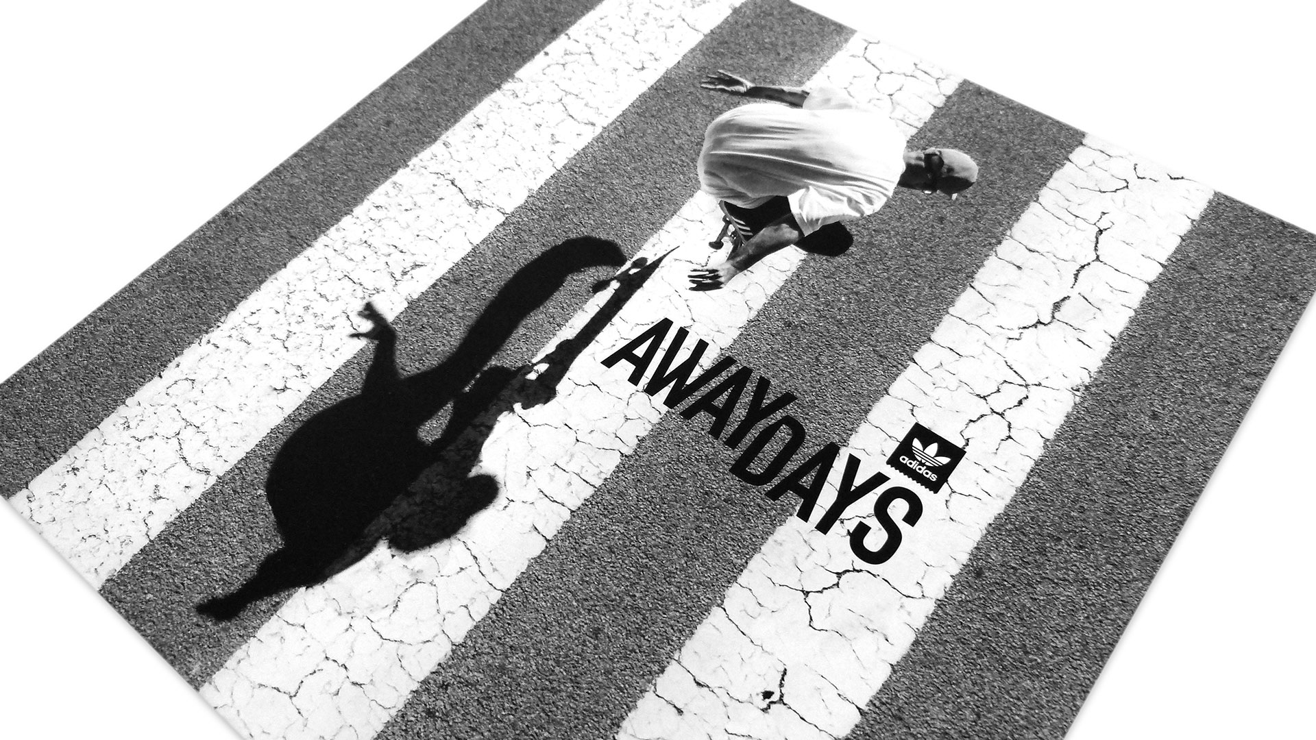
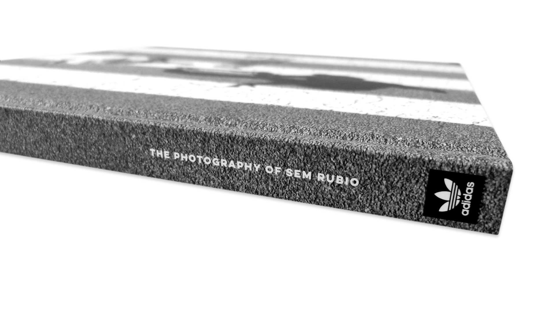
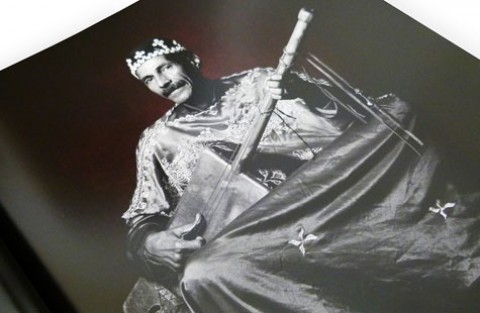
Crafted by Juice Design as one component of a larger cross-media promotional campaign for the film, the 124-page book looks like it was cut right out of the steaming asphalt of a hot city street thanks to its dramatic cover image, reproduced from a shot by the book’s photographer, Sem Rubio. Printed offset on Spicers Paper Pacesetter Silk 100 lb. Text by AMP Printing and mounted to 98 pt. chipboard with Domtar Cougar 100lb. Text end papers [Get Swatchbook], the cover comes magically to life with the application of a golden belly band. It not only offers the name of and key images from inside the book, but also enhances the cover image by separating the skateboarder from his shadow.
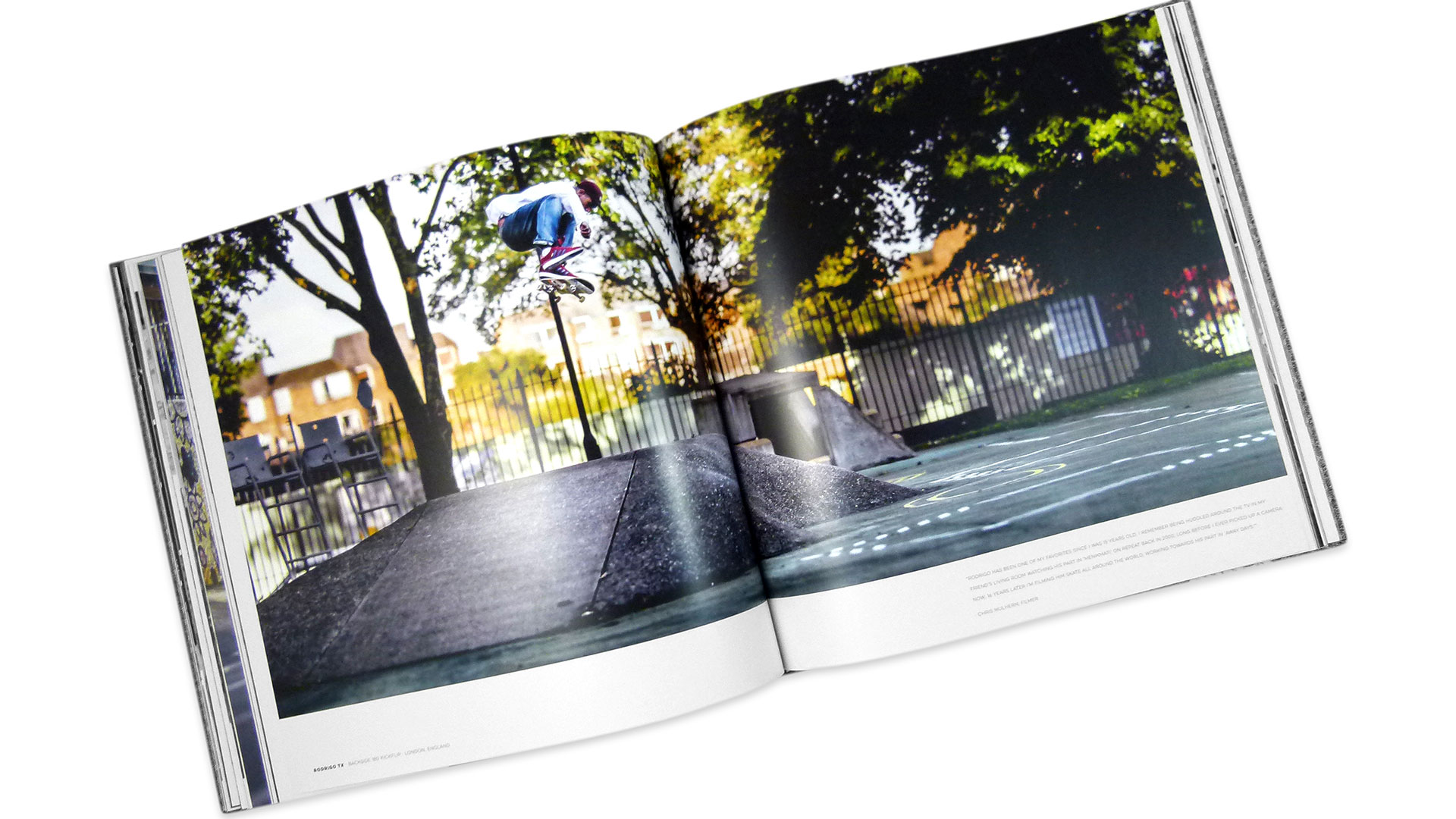
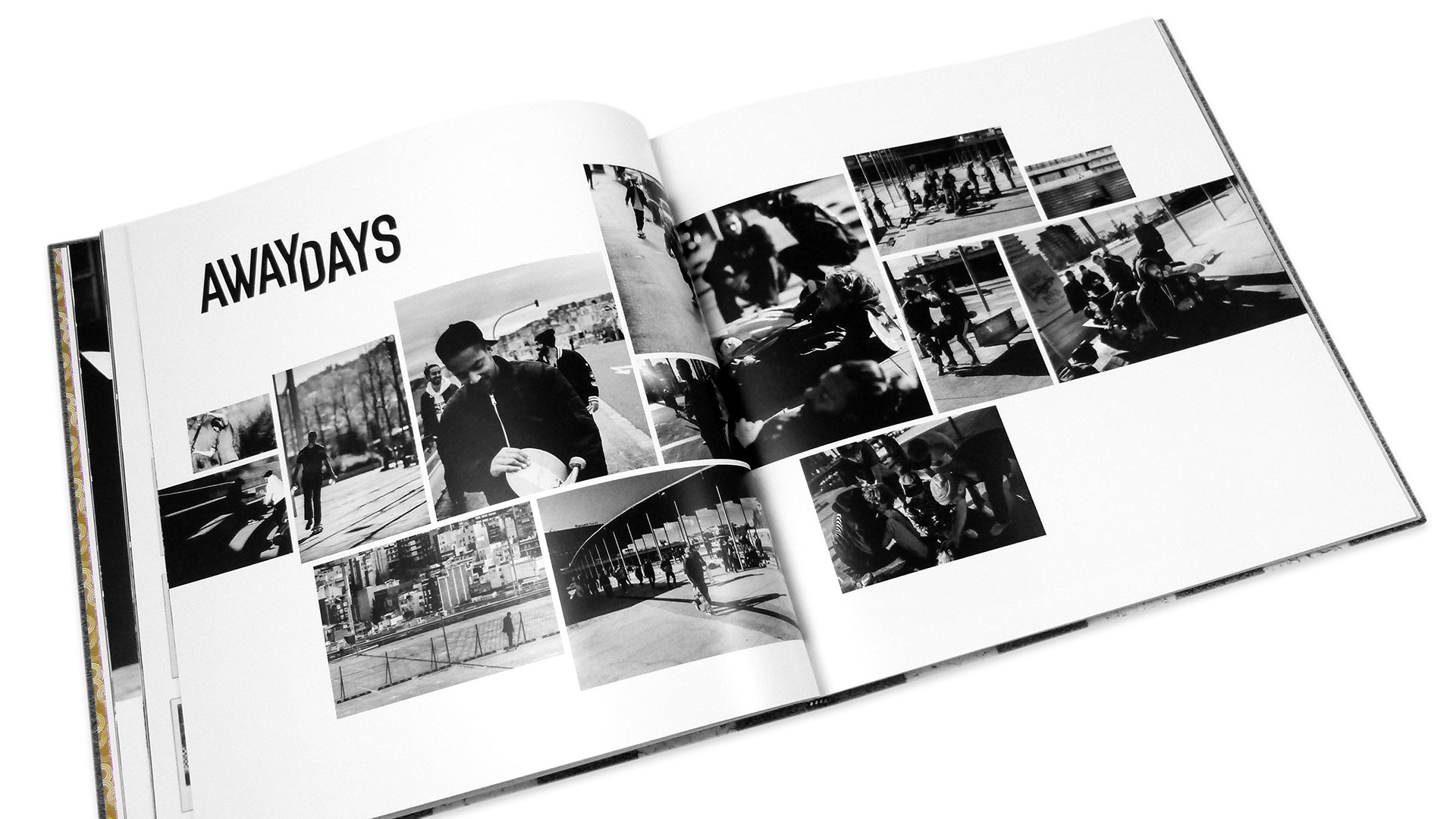
Like Adidas’ approach to skateboarding, Juice Design, which followed the skate team around for three years as part of the “Away Days” project, knows when to step aside and simply let the images do the heavy lifting, running them large and beautiful with only a bit of text to frame the event. In lesser hands we’d be overwhelmed by a graffiti-style typeface wielded by an art director trying to be “down with the kids.”
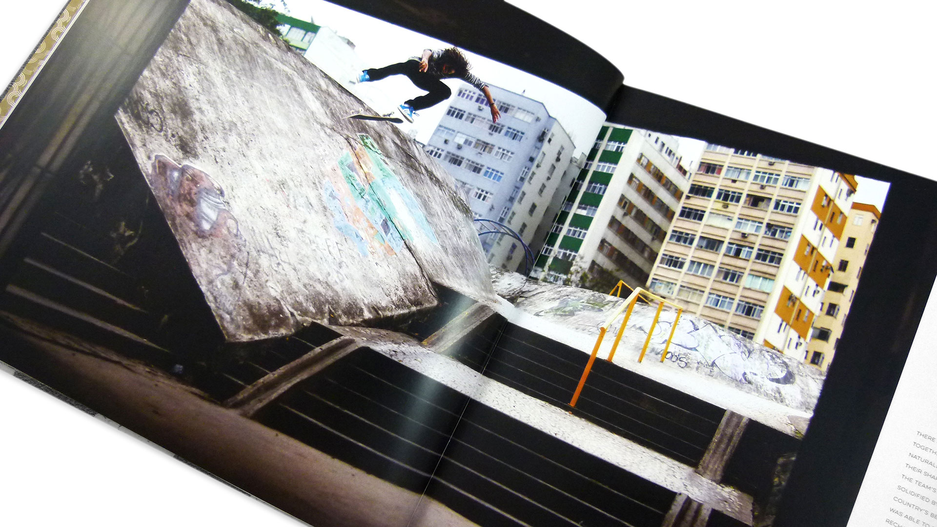
“The designer holds true to the photographer,” observes AMP Printing’s Bill Kennedy. “Sem loves dark images and captures unbelievable shots that don’t look real. Tory (Ford), who designed the book, worked with the printer to create a design that worked well with the printing process.”
Part of that entailed reproducing “these rich images using a touch plate to achieve super deep blacks while maintaining the subtle highlights,” Bill explains.
Overall, this book is a good reminder that sometimes the best design advice, like the best advice for dealing with a skateboarder coming at you full bore, is simply to get out of the way…and let the images tell your story.
Photography: Sem Rubio