By Cyd Peroni
“A lot of what I do is very intuitive. When I work on something that doesn’t feel or look good, I keep working until it does,” says Kevin Cantrell, art director, graphic designer and winner of PaperSpecs’ Take Note Award for Q3 2013.
Two years ago during a Christmas break from his full-time job as art director at Hint Creative in Salt Lake City, he decided he wanted to acquire a new skill: lettering.
“I’ve done lettering before and have a good comprehension of the basics of typography, but I wanted to start an experimental project that would push my abilities to a new level,” says Cantrell.
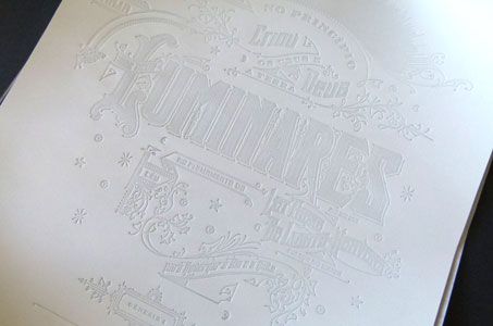
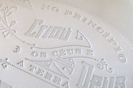
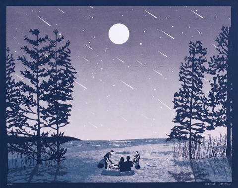
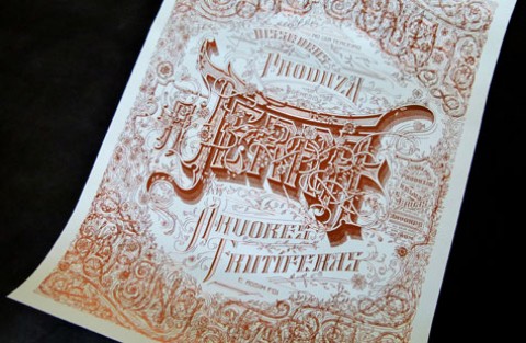
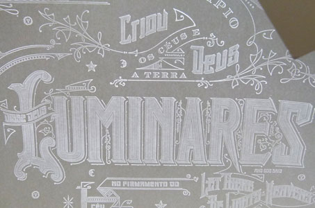
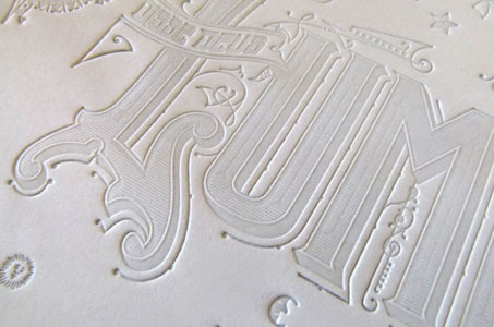
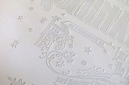
The Luminares poster, which garnered Cantrell his Take Note Award, is the result of this personal challenge. His passion for the Victorian era’s flowing elegance is evident in the structure of the letterforms he created for the piece.
“It was basically trial-and-error where I learned lettering through hundreds of hours of just making mistakes and hitting my head against the wall until, finally, it just felt and looked right. I learned a lot about balance and consistency with typography and proportion. And that’s really where the project started,” says Cantrell.
[youtube=http://youtu.be/9lC_A1E-6bU]
Designing something meaningful
That Christmas, Cantrell was looking for a project that would reflect his ideals: authenticity, truth and beauty in design.
On the poster’s inspiration, Cantrell explains, “I literally sat down with the concept of life, the creation of light from the first chapter of Genesis, and all those values that I was trying to emulate and imbue in my work.”
The creative desire was so strong that he took a financial leap and ordered the paper (Gruppo Cordenons’ Moondream) for this ambitious and expensive personal project. Moondream, a technically fascinating paper incorporating wood fiber and non-wood materials, becomes translucent when heat and pressure are applied to it.
As luck would have it, a representative from Gruppo Cordenons found out about his paper order. She contacted Cantrell, and he showed her the artwork. Recognizing its special qualities, she agreed to sponsor the poster, which has since become a series.
“I had no idea it would be successful. I had no idea it would go anywhere. It was an experimental project to learn a new skill, to create something meaningful, beautiful and inspiring.”
Let there be light
Not many people have seen the backlighting effect achievable on Moondream. The paper selection is perfectly harmonious with the original ideas that inspired Cantrell. The poster visually tells the story of light and is a seamless blend of concept, execution and production.
The process was painstaking for Cantrell and the printer – Gottschall Engraving. At first glance, the poster appears to be a really beautiful example of blind-debossed elements. Hold it up to the light, and it’s transformed into a glowing ethereal piece.
“The point size on the lines is really thin, varying anywhere from a 0.4 to a 0.9 stroke. Because there was no ink or foil, I had a little more flexibility with the point size. But I didn’t know a lot of this going into it,” says Cantrell.
Collaboration and experimentation got the formula just right. Gottschall had never produced a stamping plate this large. (The 16 x 20 plate cost $1,000 to make.) On the first few runs, the heat and pressure caused the paper to crimp and crease. A jig was constructed to ease the pressure so the heated paper wouldn’t stick to the plate. Finding the right temperature to create the translucent effect was also a challenge. The sweet spot came at around 400 degrees.
Always a perfectionist
Cantrell credits his associate, Arlo Vance, with furthering his study of typography. “He has an academic approach and a prodigious understanding of the architecture and nuances behind fonts. Arlo reeled me in when I needed it and helped me a lot as I was learning to execute the lettering.”
This talented designer looks at Luminares today and sees mistakes, primarily in composition. He thinks the second installment, Aguas (water), and the third work-in-progress, Terra (earth), show significant growth in their typographic applications. The final series will be a total of seven parts, one for each day of creation.
Cantrell sells the posters (and the metal plates that created them) on his website.
Luminares was originally featured in the PaperSpecs Gallery.
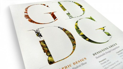
Aguas, foil stamped on Plike, was also featured in the PaperSpecs Gallery. You can read more about it here.
————–
 Cyd Peroni is a Phoenix, Arizona-based writer and owner of Three Figs Villa, an online boutique that creates and sells fine art letterpress prints for writers and wordies. Her favorite quote comes from Mark Twain: “The difference between the right word and the almost right word is like the difference between lightning and a lightning bug.”