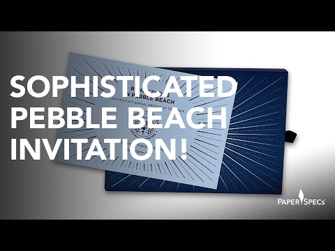
[youtube=http://youtu.be/-DqOc86cUwE]
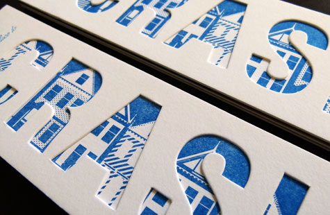
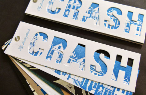
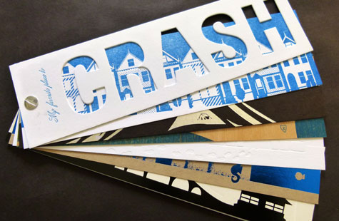
Everyone’s favorite place to crash is home of course! Whether it’s a Victorian row house in the city, an igloo on the frozen tundra, a tent in the mountains, or a house in the tallest tree, there’s just no place like home (pardon the cliché), and there’s no better way to show off what this particular client can do than with this clever promotional piece designed by Valerie Wilson.
Playing off of the client’s name (Event Crashers), the piece features favorite homes/places to crash and the many capabilities of Event Crashers Letterpress. Each page is illustrated by a lovely image and uses a different substrate and ink or foil that helps to solicit feelings of the scene.
The fan deck format with the screw-post binding is perfect for designers who will use this as a handy resource. The diecut front cover and the last page with all the specs are invaluable inspirations. My favorite page is the tree house printed on Birch veneer. Then again … I do like the subtlety of that white foil on the pagoda … oh but look how that metallic foil plays against the black chipboard.
Love this piece?
Like it and share with your friends below.