By Cyd Peroni
A small lump of gray clay, an even smaller instruction booklet, and one tiny pair of instantly recognizable black eyeglasses. These were the ingredients for a worldwide celebration of 77 years of advertising genius. No wonder it won PaperSpecs’ Q2 2013 TAKE NOTE Award.
When tasked with designing the invitation for Leo Burnett’s 77th anniversary, the creative design team in the Chicago office immediately hit on their special connection to the agency’s founder, and to the number seven.
“Here at Leo Burnett, we judge our work on a 1-to-10 scale called the Humankind GPC Scale (1 being a concept that is destructive and you wouldn’t want to put it out in the world, and 10 being an idea that literally changes the world and humanity for the better).
“Of course, we’re always shooting for a 10, but we most often strive to achieve a 7+. So the 77th anniversary, with the double sevens, led us to the idea that everybody in the building should get to feel what it’s like to craft something, to make something beautifully inspired,” says Alisa Wolfson, group design director for Leo Burnett’s Department of Design in Chicago.
[youtube=https://www.youtube.com/watch?v=HDkUn_n-8rk]
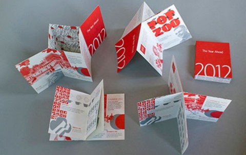
The BIG idea
It’s this very concept that drew Mary Scott – executive director for the School of Graphic Design at the Academy of Art University in San Francisco – to pick the invitation package as PaperSpecs’ Take Note Award Winner for Q2 2013.
“While the execution of the vehicle and details like the typography are outstanding,” explains Scott, “what sets this entry apart is the big idea that gives the piece such great meaning.”
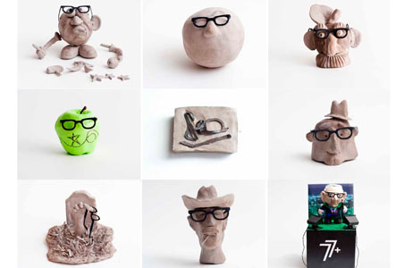
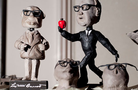
Employees at the Chicago campus received the invite, which asked them to celebrate the company’s 7+ decades of creativity and craftsmanship by sculpting their own busts of Leo Burnett. The surprising results were as original as the employees –some 1,800 at this location.
“One of the interesting things about the project was that most of the work from the clay modeling came from all over the agency, from accounting to finance to production. We really encouraged mass participation. Very little from the creative department – that was the interesting thing – an overwhelming participation from the advertising agency and not necessarily only from the creative community within it,” says Wolfson.
Big creative ideas in small packages
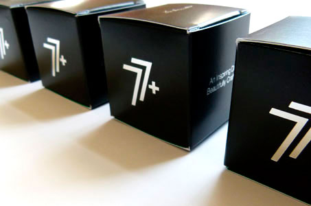
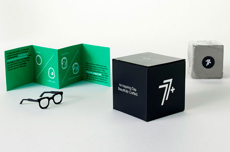
Wolfson explains that they wanted to package the clay in the most sophisticated way, but also the most beautiful. The chunk of shrinkwrapped clay fits perfectly inside a 2 ¼”-x-2 ¼” black box. A tiny accordion-folded brochure, which encourages invitees to set their imaginations free, rests perfectly atop the clay.
To keep everything consistent, the design uses the brand’s black and silver colors. The little brochure incorporates some green, Leo Burnett’s tertiary color.
“We were very lucky that we had good print partners who let us finish the outside of the box with some specialty foil stamping,” adds Wolfson. “My favorite part is the tiny pair of black glasses that we were hoping people would use to augment their sculpture.”
Leo Burnett’s iconic eyewear
From the traditional approach to a deconstructed take (tearing the paper eyeglasses apart to create Leo’s signature), people crafted a large gamut of interpretations using the founder’s signature accessory.
Wolfson describes some of them as very conservative and on brief, while others as very, very whimsical, exciting, unexpected and spontaneous. She donated her sculpture to the agency’s archive, but still has her tiny pair of Leo Burnett glasses hanging on her bulletin board.
“It’s funny because we used to have a very, very, very, very large-scale pair hanging in our lobby,” remembers Wolfson. “Now we have a very, very, very, very small pair, too. We’re really into the glasses here. They were Leo’s glasses … and quite in fashion again today.”
NOTE: See more inspiring designs in our weekly Paper Inspiration video series.
————–
 Cyd Peroni is a Phoenix-based writer and owner of Three Figs Villa, an online retailer, which creates and sells fine art letterpress prints for writers and wordies (opening autumn 2013). Her favorite quote comes from Mark Twain: “The difference between the right word and the almost right word is like the difference between lightning and a lightning bug.”