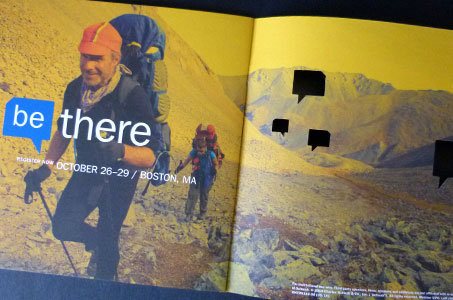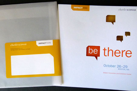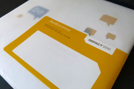
This invitation prompts recipients to “be” dynamic, compelling, nimble. The design conveys all those attributes and entices invitees to “be there” with an irresistible printed personality.
I love translucent envelopes because they allow for a sneak peek that makes me want to open the mail piece immediately. Once inside, diecut quote bubbles, which appear on the front and back cover, tell me visually that there will be a lot said at this event worth remembering. Plus, the diecut windows continue to beckon me onward.
An unexpected (for a financial gig) color palette really works. Contemporary hues of orange, yellow and green communicate a cutting-edge, in-touch advantage. The conservative blue assures me that the presentations will be solid and sensible advice. Printing on the uncoated 65 lb. Mohawk Options Vellum Cover gives it a personal feel.
And for something that often gets lost amid “the pretty” … how “the information” is presented. The designers do it in noteworthy fashion here. Charts are attractive. Type is readable. Subheads are properly highlighted and key facts well organized. (I’m keeping this invite with me at all times!)