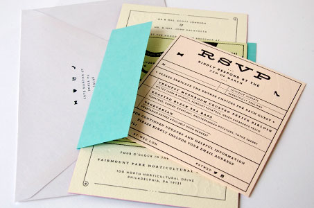
Every detail of the wedding invitation for this enchanting couple is attended to with particular care. From the pastel hues reminiscent of a French garden to the storybook romance of the illustrations, we fell in love with it all.
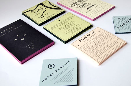
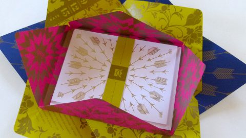
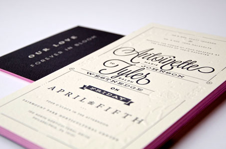
Four colors of Arturo paper (Soft White, Pale Pink, Celadon and Pale Blue) were duplexed to achieve the rich texture and thickness desired on each of the various-sized panel cards. The largest card is edge painted in hot pink adding a colorful contrast to its black and cream palette.
The design team on this project (some of whom also happen to be the main characters in this love story) chose letterpress printing (the Prince Charming of any special invite). Blind impressions combined with the inked impressions add depth and interest, but the floral motif on the main card got our hearts fluttering.
Four tiny icons (heart, bow tie, wedding rings, and high heels) make subtle appearances throughout and become the logo for this branded event, which included a dedicated website using all the same elements from the printed invitation.