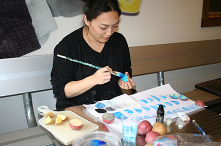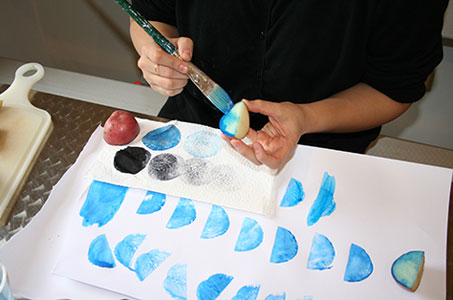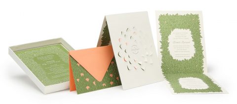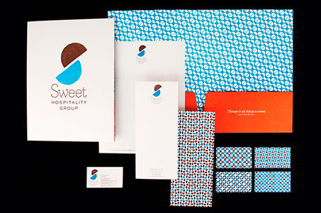
You might expect that creating an identity and communication program for a leading concessionaire and catering company would involve food inspiration of some sort. What you might not expect is actual food being used in the design process! And no, I’m not talking about flinging French fries across the room at co-workers.
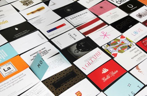
Remember the potato prints you did as a kid? This design team used that very idea to create the logo (a contemporary “S” shape) and the great geometric patterns used on the stationery components. (Each person in the company has a different pattern on the back of his/her business card … love that touch of individuality.)
The texture of the Mohawk Via Satin feels great and enhances the variations and gradations, imperfections and irregularities throughout all of the patterns, which makes each piece look as if it has been stamped by hand.
To read more about this project or to listen to an audio interview with the designer, click here.
Sweet Hospitality Group Identity Program was featured as a Paper Inspiration.
[youtube=http://youtu.be/LCOrn8dNcro]