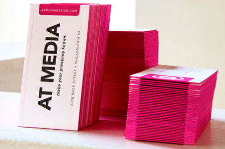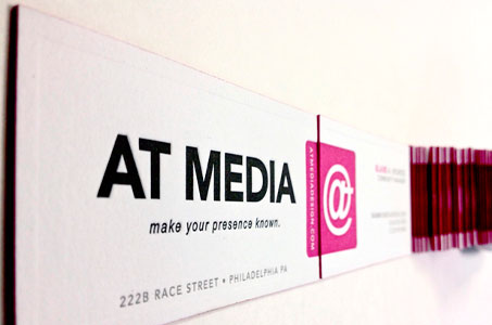
The tagline of At Media is “Make Your Presence Known.” And with this fun, colorful and inventive business card, they’ve done just that.
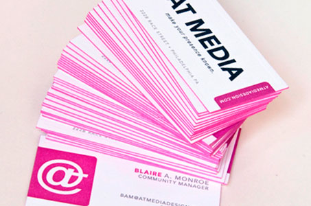
The logo is a clever take on the @ symbol where the stem of the “a” does double duty as the stem of the “t”. Between the paper and the letterpress impressions, the card feels lusciously textured.
But color palette is the real story here. Hot pink! Wear this passionate shade and you’ll definitely get noticed. To get noticed in the right way, the designers floated it on a field of white with touches of soothing gray.
The gray is interesting in that Cool Gray 7U is used for small text on one side of the card and a 50/50 mix of black and opaque white is used for a large color block of a matte charcoal gray on the other side.
But we’re not done with the pink just yet. The first names appear in this same perky hue, a nice touch that adds interest but also says these folks are casual. And as is the trend right now, the edge of the cards are “painted” hot pink as well.
At Media Business Cards were featured as a Paper Inspiration.
[youtube=https://www.youtube.com/watch?v=M2ZW1iUHMWg]