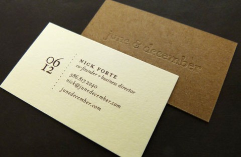
When the word “art” appears in the name of the company that deals in fine art acquisition and management … well, what better inspiration can a designer receive when creating an identity package?
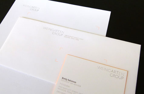
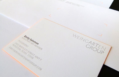
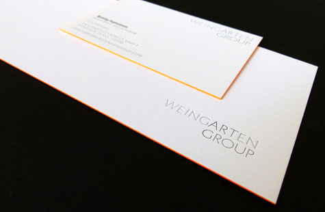
The design team at Rigsby Hull developed the new word-mark, which subtly highlights the “art” in Weingarten via a darker ink color. (The mark is also used on the website and blog as well as communications surrounding the launch).
Selecting the Kid finish on the Crane’s Crest adds a high-end, refined texture to the letterhead, notecard and envelope. The letterpress work is delicate and understated. Eliciting the image of canvas corner, a chevron shape composed of small dots appears on each piece in bright orange. Edge painting on the notecard and business card is done in a matching orange that glows with bright warmth.
The suite is appealing on every level with a sense of contemporary style and energy.