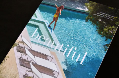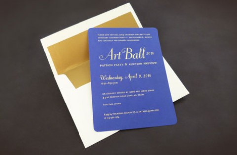
The distinctive characteristic described in this brochure for fine rugs has a lot in common with fine paper – “they perform as beautifully as they look and feel.” Exceptional designers like Tom Nynas, creative director at David Sutherland, Inc., understand this and know how to use paper to create a sense of place and mood. From first page to last, it’s a luxurious experience.
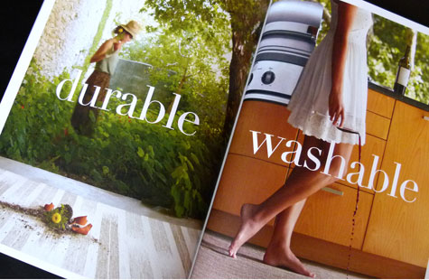
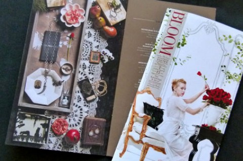
All the design elements are just different enough to convey unique styling and personality. A slightly-larger-than-normal size (9.5 x 12.75) immediately sets the piece apart. The felt finish of the Mohawk Via pairs perfectly with the brand’s message of a sensuous feel. The uncoated sheet adds an intimate quality to the beautiful images that show off the vividness and brightness of a warm, sunny day.
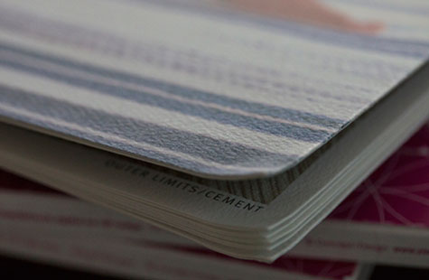
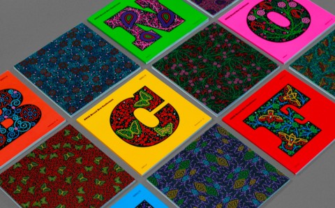
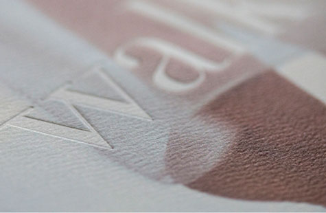
Big, bold reverse-to-white headlines have been register embossed on every page – adding even more texture for our fingers. French folds lend extravagance to the look, but also serve to hide the deboss effect on the back side of the sheet. A special tip of the hat goes to the production team that perfect bound such a tiny spine.