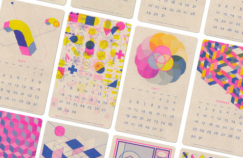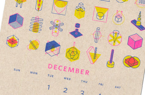
If a screen printing stencil and photocopying machine got married and had a baby, it would be named Risograph. Toronto-based Paper Pusher has brought a fun and funky 2015 calendar into the world using this digital technique.
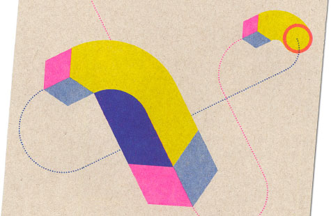
Printed on Oatmeal Enviro100 Vellum Kraft paper in three spot colors – Fluorescent Pink, Blue and Yellow – Jp King has clearly mastered the art of designing for overprinting and combining colors.
Inspired by constructivist utopian geometry, matchbox covers and abstract architecture. King uses strong lines, delicate as well as chunky halftones, and isometric graphics to create the illusion of depth on each round-cornered calendar sheet.
The natural distressed look of the Risograph method adds a texture that takes these vector graphics out of the virtual realm and into the physical world. And really, don’t the best calendars actually hang on a wall? Given this one is produced on 100 percent recycled paper with soy-based ink, it’s also guilt free. Happy New Year!