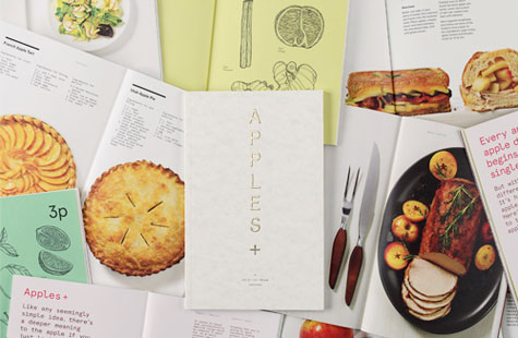
As old as a Celtic fertility symbol, as famous as a man casting seeds, as diverse as 7500 varieties, as iconic as the agency responsible … Leo Burnett Group created an apple cookbook as fresh and delicious as the fruit itself. So why apples? Ah, there’s a juicy tale all its own. The receptionist set out a bowl of apples on opening day in 1935. That tradition continues to this day in every Leo Burnett office around the world.
This piece served as a companion gift to the agency’s corporate holiday card, giving recipients something special and useful to keep. The apple theme provided an opportunity to show a very human side of such a large company, and sharing the recipes made for a memorable personal connection.
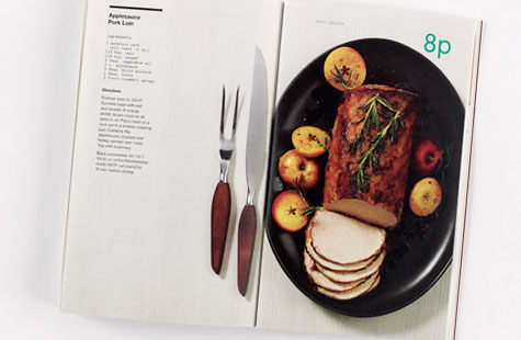
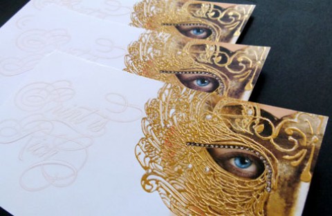
Uncoated Parchtone Natural Cover and Via Cool White Vellum Text work so well together here. The shiny gold foil and emboss on the front cover add texture and contrast. The beautiful tabletop photography really brings the project to life. Each image incorporates a strong, bold and structural element to the layout.