Really great parties blend three essential ingredients: mouth-watering food, interesting people and a splash of spirits.
If you’re a brand-marketing agency like Minneapolis-based FAME, an all-important fourth element — the invitation — is key to setting the tone for a fun and entertaining event. Not to mention, it’s the perfect opportunity to let the agency’s creativity shine.
FAME recently received PaperSpecs Gallery’s Take Note Award for the enticing invite created for its annual open house.
Guest judge for the third quarter competition, Gaby Brink, founder and executive creative director of Tomorrow Partners, immediately knew this was the winning piece. “From the fun illustrations that brought the theme to life to the metallic inks and beautiful letterpress work, this entry really stood out above the crowd,” explains Brink.
[youtube=https://www.youtube.com/watch?v=xNs7RdeSVl8]
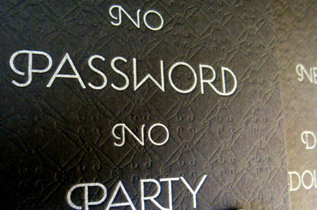
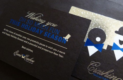
We’re Gonna Party Like It’s 1929
“We host a much-anticipated open-house party for our clients, vendors, business partners, and other agency friends each year,” says Bruce Edwards, executive vice president and chief creative officer of FAME. “The theme is based on the type of alcohol and food served at the event. This year, with ‘Boardwalk Empire’ being the trendy, hot new show that brought back drinks like Manhattans and Old Fashioneds, we conceived a hush-hush speakeasy called ‘The FAME Laundry House,’ — a nod to the 1920s Prohibition where all the secretive partying happened behind closed doors.”
 FAME’S concept, copy, iconography, typography, paper selection and printing technique are what made this design stand out. All of the elements involved work together seamlessly to create a modern twist on a classic era.
Simple Design is Not Easy Design
On the surface, the invitation package seems simple enough: four round-cornered cards plus a cute pin to wear to the party tucked inside an envelope.
“Things that look simple and clean are often the most complicated to design because you still must have nuanced detail,” explains Edwards. “Otherwise, simple and clean can get dull and boring pretty fast.”
Some examples of the nuanced details put into this award-winning invitation are the use of playing card symbols (hearts, clubs, diamonds and spades), which weave the gambling aspect into the design. Another example is the repetitive use of the curled motif in the flapper’s hair, the gentleman’s mustache, and Good Time Charlie’s greased hair. The hanger symbol for the FAME Laundry House repeats on the black cards as a blind-debossed pattern detail.

Letterpress for Style, Detail and Budget
“Our original concept called for sleek varnishes, foils and custom envelopes. That quickly died based on budget,” says Edwards. “We switched to letterpress and printed black on white paper and silver on black paper. By changing the printing method, we were able to create a rich, substantial piece without breaking the bank or losing the integrity of the design.”
Each invite card was duplexed after printing to create a double thick 220 lb. Cover. This had the added benefit of hiding the letterpress bruising on the back. The blind-debossed pattern gave the impression of leather.
Appealing, humorous copywriting was also an integral part of marrying the bygone era to the modern day. Recipients were required to R.S.V.P. to get their “password” admission for the festivities. This is a brilliant way of engaging the audience, creating buy-in, and serving as an enhancement to actually reply.
“The attention to detail and the tactile feel achieved through the paper choice and the letterpress debossing really set this entry apart,” says Sabine Lenz, founder of PaperSpecs.com. “FAME’s team can count me one of their admirers who can’t wait to see what they design next year for the party.”
NOTE: See more inspiring designs in our weekly Paper Inspiration video series.