By Christopher Simmons
The recent PaperSpecs/VMA Storyboard webinar À La Carte – Cohesive Brands Across All Media was one of the most enthusiastically received events we’ve ever put on. Much of that was down to guest speaker (and MINE principal/creative director) Christopher Simmons, and to the delightfully sassy project he shared with us – the Bun Mee Vietnamese eatery. Simmons graciously agreed to answer your post-event questions below. Enjoy! –ed.
……
What made you use the word “quintessential” with Vietnamese cuisine? Why not a more ethnic-specific word meaning the same thing?
Good question. Denise, the owner and a Vietnamese-American, really wanted to stay away from creating a kind of faux-Asian environment. A lot of Vietnamese restaurants use a lot of green, a lot of bamboo, traditional Vietnamese sedge hats, etc. She explicitly wanted to stay away from that. The Vietnamese elements and references you see in the brand are all brought in from a Western point of view.
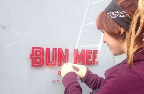
What typeface was used for the Bun Mee brand? Love it!
Thanks. The Bun Mee logotype was custom drawn, but based on Refrigerator by Mark Simonson. We also use Banque Gothique (a riff on Bank Gothic).
Why didn’t you guys use the scooter instead of the MINI Cooper? Was there ever discussion of using a scooter for product delivery in addition to the MINI Cooper?
We all wanted to run deliverers on red Vespa’s, but they do some pretty big catering orders and the scooters just weren’t up to the task. Plus the insurance is really high. The MINI Cooper is all-weather and super cute. We’re working on a fleet of custom-painted bicycles, however!
Can we get info on where to purchase the T-shirts?
Editor’s note: The shirts can only be purchased at the two Bun Mee locations – Market Street and Fillmore Street – there’s no online option at present. And from now until April 30th, Bun Mee has graciously offered to sell T-shirts (without the cans) at cost – just $11. They must be purchased in person. Please email Denise at [email protected] [sic] with your shirt size and preferred pickup location.
This might also be a good time to congratulate the following 10 people who won T-shirts during the live webinar. They are:
- Lucas McKean
- Lorna Dansalan-Collazos
- Robin Swennes
- Joanie Cahill
- Sherri Brown
- Sarah Bartell
- Marie Lyons
- Carly Giancaterino
- Elaine Chan
- Dane LaChiusa
Did you consider expanding the experience to external events?
I didn’t show it, but yes. Bun Mee was at the big Outside Lands music festival last year, and they’ve done some other events, too. We have some pop-up signage and promotional elements that support those types of venues.
How are Christopher and MINE associated with VMA Storyboard?
We’re not. We’ve been asked to share some of our projects with VMA Storyboard and are always happy to oblige. Years ago I also judged a few VMA competitions (it was called PINC back then). VMA Storyboard features a number of different designers and projects. We just happen to be one of them.
What level of interaction is there with mobile technology?
Not much. The website works on mobile (though not in a super-optimized way), and the restaurant is fairly active on Twitter (which I consider a mostly mobile experience). We’ll probably create a streamlined mobile site down the road.
CLIENT APPROACH
How long was the process, from start to finish (first meeting with client to store opening)?
Our first meeting was in October and the restaurant opened at the beginning of April. That’s a pretty typical timeline for a restaurant. We were pretty heavily involved throughout, coordinating with architects, fabricators and installers, getting the food shot, and basically overseeing the implementation of the brand.
How do you keep clients from making these decisions based on personal intuition versus what they envision for their business?
That’s mostly up to the client. Denise is a very savvy business owner. She also believes in the importance and power of good design. We worked closely together at the beginning to define her goals, and then we did our best to honor them.
Regarding the cheat sheet you give your client to fill out: should they answer based on their personal preferences or based on how they see the brand?
A little of both. We like to keep it brand-focused, but personal preference inevitably creeps in. Personal preference creeps in on our side, too, even when we’re trying to stay brand-focused. I think the cross pollination of strategy and intuition is important.
Do you have any contract docs you’d like to share?
Yes we do, but I’m afraid I prefer to keep them to myself. Our contract has evolved over the years, but it is based on AIGA’s Standard Agreement for Design Services, which is free to download.
How do you balance what a client thinks they want/likes versus what you think will be successful?
That’s different for every client. Some of the foundational work we do (that visual survey, defining core values and personality profiles, etc.) is designed to give us a tool to refer back to when evaluating design. I’ve found it to be tremendously helpful in removing some of the subjectivity from the process. With a small business like a restaurant, however, often the client/owner is the brand. Capturing their personality and infusing it into the design is actually very important.
CONSTRUCTION
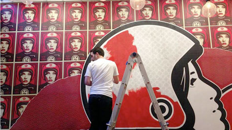
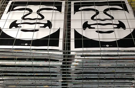
Are the wall murals you installed Shepard Fairey or intentional imitations?
All the components of the mural are original designs, though heavily influenced by Fairey’s style. Some elements (like the black-and-white Mama Tran face) are a direct homage to Shepard. We acknowledge/credit his influence on the piece.
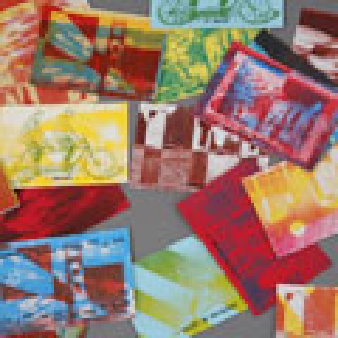
How was the wall mural applied? It looks like a collage but there were images of it being hand painted.
There are approximately 311 posters in three layers that make up the base of the mural, some of which are torn to reveal the layer of posters underneath. Most of these are 2- or 3-color offset prints, some designs we silk screened ourselves. The large format elements are just huge Xeroxes in 3’ x 12’ strips. We hand-mounted all of the posters and the large figures with wheat paste. The helmets on the large heads were hand painted. The sunburst was masked out with tape and spray painted. The whole thing took about a week to install. I created a photo gallery that shows this whole process, if you’re interested.
On the scale up of the Bun Mee menu, how were the individual panels attached for mounting? It didn’t appear that there were any face penetrations.
Simple Velcro. We used magnets at another restaurant, but Velcro and some industrial adhesive works great.
BUDGET
How did you handle pricing on such a complex, constantly moving project? (There were other questions about budget, too. I’ve lumped them all together here).
We had a negotiated budget at the start of the project. This included our fees for the design work as well as rough estimates for production supervision. Since the materials, scale and scope of the signage and decor elements weren’t known in advance, we couldn’t estimate those. We did have a ballpark figure allocated for production, and we tailored our design to meet that target.
When it came to things like hand-painted signs, we discussed the cost (vs. vinyl and other applications) as well as the benefit. In the end we all agreed that the additional cost was worth it.
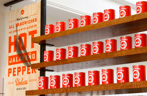
For the second store, the mural was a huge unknown. We all knew it was going to be very expensive and time consuming, but Denise put some money aside for it and we made it work. Some of the other elements (like the plywood posters and the tin can packaging) are surprisingly inexpensive. We tried to balance things out.
Things always come up. A vendor underestimates part of the job, permits get more expensive, the neon sign needs a dedicated electrical circuit, etc. When they do, we just have an open conversation with the client about the additional costs.
Did your firm supervise all of the building graphics executions and get paid for it? Did you provide the templates for painting? Contract the sign painters?
We did. Anything graphic or typographic was designed by us. For the hand-painted signs, we supply Illustrator files to the sign painters. They make templates from those and we oversee the final application. We contract the painters and fabricators and work closely with them to achieve the results you see. This doesn’t just mean telling them what to do—we listen and collaborate with them to arrive at the best materials, techniques, etc. And yes, we get paid for all that work. As much as I love design, at the end of the day it’s how I make my living.
…….
 Christopher Simmons is the principal/creative director of the noted San Francisco design office MINE where he designs and directs projects for a variety of clients, including Facebook, Microsoft, Wells Fargo, The Nature Conservancy of California, Chronicle Books, Simon & Schuster, and many nonprofit and entrepreneurial clients. His work has been exhibited at The Museum of Contemporary Art in Hiroshima, The Pasadena Museum of California Art, The Museum of Craft & Design, The Smithsonian Institution, and is part of the permanent design archives of the Denver Art Museum.