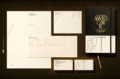
This studio typographically invites you to literally turn the business card (plus the notecard, letterhead, label and envelope) around to connect with the logo and its literal meaning, imparting an extra dose of memorability to the identity.
The sophisticated stationery design remains lithe and delicate under the restrained use of multiple print techniques (blind embossing, edge gilding and foil stamping) and a strong color palette (black, red and gold).

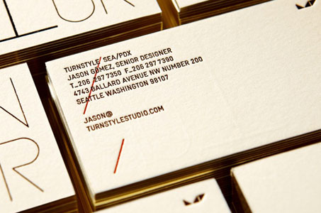
For all its exciting eccentricities, like the red diagonal slash through most of the contact information on the business card (a nod to the fact that the only thing we really want to know is the email address), each stationery item remains true to classic human elements.
From the Savoy Natural White Cover and Eames Painting White Vellum Text to the Strathmore Soft Writing Label and Via Light Green Smooth Cover, gentle colors soothe the eye and thick, tactile stock connects us as only print can.