Letterhead / Identity

Food Safety Training Solutions Identity

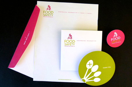
Good branding, just like good food, is all about executing the basics well and building from there. That’s why we liked the approach the designers took with their clients on this identity system.

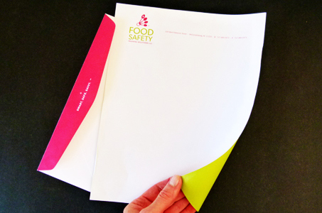
They started with a unique and recognizable logo based on measuring spoons, which serves to anchor the suite of letterhead, envelopes, business cards and note cards – any company’s first impression to their prospective clients.

This system, designed for a business that specializes in training people who touch food served to the public, distinguishes itself by the diecut circle shape (plate of food anyone?) used on the business card and a thank you card.

The color palette of spring green and raspberry red evokes images of fresh and delicious fruits and veggies. We say “Yum!” to the whole package.

Please rate this piece and add your comments below:

VN:F [1.9.13_1145]
Rating: 9.5/10 (12 votes cast)
VN:F [1.9.13_1145]
Rating: +9 (from 9 votes)
Food Safety Training Solutions Identity, 9.5 out of 10 based on 12 ratings
Print Friendly
Project Details
Title Food Safety Training Solutions Identity Client Francine Gibson-Shaw Date September 2011 Design Laura Wallace, Amber Buhrman Print J&M Printing
Waynesboro, PA
Paper Domtar Cougar Smooth White 70 lb Text and 100 lb Cover
Production Details
Dimensions 8.5" x 11", #10 Envelope, 2" Round business card, 5" round thank you card Print Quantity 1,000 Production Time 2 weeks Printing Method offset Number of Colors 2 spot colors Finishing and Binding 5" Circle Die cut on thank you card; 2.5" Circle Die cut on business card; flat sheet envelopes, converted for flap coverage


Leave a Comment

Your email address will not be published. Required fields are marked *

*